I have researched the trends of design in 1950’s. I have looked at different media products from poster adverts to food packaging. What is noticeable is that during that time dominating use of strong, saturated colours, mainly primary colours. Text could also be seen written in bright striking colours. Different types of typeface can be spotted, san-serif, serif and decorative sometimes all used together, to make emphasis on the words and phrases.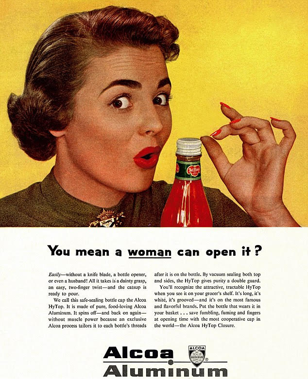
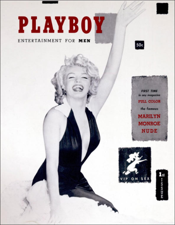
At the time women were often objectified what can be clearly seen in the designs, with its sexist slogans and representation of women. They were often the main focus of the advert to make it more attractive for men. In 50’s we also see the first issue of ‘Playboy’ magazine featuring Marilyn Monroe on its cover. The use of celebrities in iconic designs shows the influence of movies becoming widely available and television becoming more popular as the famous people were easily recognisable.

Despite some things that are socially wrong about adverts and designs from 1950’s I find the style really appealing with the saturated colours and variety that is different from minimalistic, clean and monochromatic designs that we often see today.
